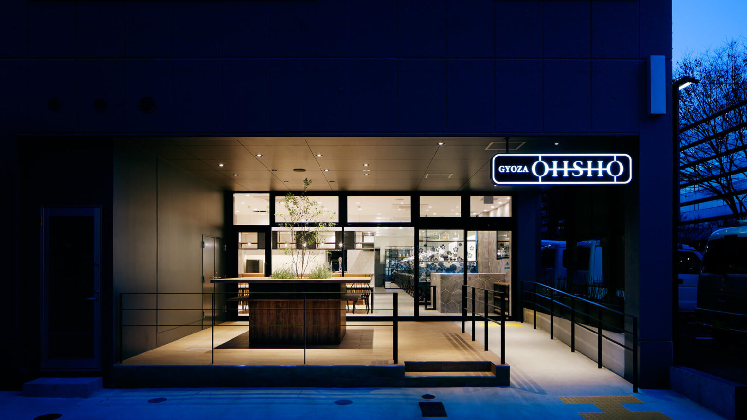
GYOZA OHSHO 烏丸御池店
2016
京都本社の大手飲食チェーン店「餃子の王将」の新コンセプト店のプロデュース及び設計デザイン。既存店舗の王将は「早く、安く、美味しい、町の食堂」のイメージであり、既存の顧客層には根強いファンが存在する。ただし女性やカップルが自ら、特にハレの日に来店するにはほど遠い印象であった。目指す所は今までの顧客層とバッティングせず女性が入店しやすく、更には海外戦略を視野に入れたジャバニーズカジュアルをコンセプトにした店舗の構築。
それは今までの既存店舗とは全く異なる店舗を創り、今まで存在しなかった客層の開拓である。「女性」や「カップル」「外国人」など取り込めてない客層は無限だ。女性に選ばれる店、それはどことなく「優しさ」や「落ち着き」「カジュアル」さも持ち合わせた空間。その表現としては、和を感じさせる紋様などのモチーフをアイコンのようにグラフィック化して用いたり、アイアンや照明のコードなどの華奢な黒いラインなど日本の「お箸」をイメージさせる質量の軽いアイテムで空間にアクセントを付けたりと既存王将を「男王将」と称するならば「女性王将」として真逆の印象を持たせるセンセーショナルなデビューを目指した。
更には成功に導く為にソフト面でもバックアップ。店内の空気感に華を添える音楽の選定やディナータイムの照明の演出、強いてはサービススタッフのトレーニングまで徹底的に実施し内実ともに全く異なる店舗を創った。様々なシチュエーションに応えられる様にスタンディング席、対面の視線が気にならない程度の適度な距離をおいた大テーブル、ドリンクメニューの充実により設置したバーカウンター、カジュアルなソファ席、個室感味わえるセミ個室など変化をつけた。何よりクライアント側の理解により、ロゴマークの新設は何より上記の全ての目的を果たせ大きな意味を持てたと思う。
GYOZA OHSHO Karasuma Oike
2016
Production and design of a new concept store for the major restaurant chain “Gyoza no Ohsho,” headquartered in Kyoto. The existing Ohsho stores are known for their image as “quick, cheap, and delicious local diners,” and they have a loyal customer base. However, they were not particularly appealing to women or couples, especially for special occasions. The goal was to create a store that is welcoming to women, without clashing with the existing customer base, and to develop a concept of “Japanese casual dining” that also considers overseas strategies.
This involved creating a completely different type of store from the existing ones to attract a previously untapped customer base, including “women,” “couples,” and “foreigners.” The aim was to create a store that women would choose, characterized by a sense of “kindness,” “calmness,” and “casualness.” This was expressed through the use of motifs that evoke a sense of Japan, such as traditional patterns, graphical icons, and delicate black lines reminiscent of chopsticks, like thin iron and lighting cords, to add accents to the space. If the existing Ohsho could be called “Male Ohsho,” this new concept aimed to sensationally debut as “Female Ohsho,” with a completely opposite impression.
Additionally, to ensure success, support was provided on the soft side as well. This included selecting music to enhance the atmosphere inside the store, lighting effects for dinner time, and thorough training for the service staff to create a store that is different in every aspect. Various seating arrangements were designed to accommodate different situations: standing seats, large tables with sufficient distance to avoid direct eye contact, a bar counter for a more extensive drink menu, casual sofa seats, and semi-private rooms for a more intimate feel. Above all, thanks to the client’s understanding, the establishment of a new logo was significant in fulfilling all the above purposes.
Interior designer / Director: MIKI Orihara
Graphic designer: KEI Sakai
Graphic designer: KEI Sakai
Photo: © Nacása & Partners Inc. FUTA Moriishi